Forgetting Sarah Marshall cinematography — film frames and visual analysis
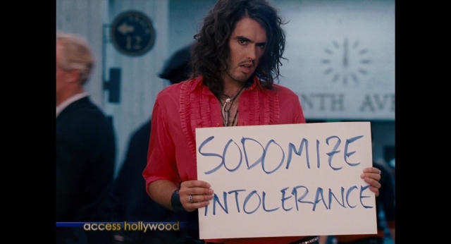
Explore 610 frames from Forgetting Sarah Marshall and study the film’s composition, color palette, lighting, shot scale and aspect ratio. Open any frame to use composition guides, color analysis and false color tools.
610 frames
1.85:1
Mostly wide shots




Visual profile of Forgetting Sarah Marshall
This visual profile is calculated from 610 frames available in the WatchTheFrame collection.
Color palette of Forgetting Sarah Marshall
Lighting and tonal range
Brightness: higher than 70% of films in the collection
DarkBright
Contrast: lower than 55% of films in the collection
LowHigh
- Saturated colors appear frequently in these frames.
Composition and shot characteristics
Explore the visual relationships
Kak menya zovut (2014)
96% color similarity
No Strings Attached (2010)
95% color similarity
Lethal Weapon (1987)
93% color similarity
21 Jump Street (2012)
93% color similarity
Blazing Saddles (1974)
92% color similarity
The Fault in Our Stars (2014)
91% color similarity
Cool Runnings (1993)
91% color similarity
A Nightmare on Elm Street Part 2: Freddy's Revenge (1985)
91% color similarity
Eighth Grade (2018)
89% color similarity
Per qualche dollaro in più (1965)
89% color similarity
Angst essen Seele auf (1974)
89% color similarity
The Fighter (2010)
88% color similarity
Butch Cassidy and the Sundance Kid (1969)
88% color similarity
Strictly Ballroom (1992)
87% color similarity
Fanny och Alexander (1982)
87% color similarity
Visual tags in Forgetting Sarah Marshall
Films with a similar visual profile
No Strings Attached (2010)
95% match · 392 frames
Kak menya zovut (2014)
94% match · 363 frames
A Nightmare on Elm Street Part 2: Freddy's Revenge (1985)
93% match · 391 frames
Cool Runnings (1993)
93% match · 683 frames
Lethal Weapon (1987)
93% match · 766 frames
21 Jump Street (2012)
92% match · 559 frames
Angst essen Seele auf (1974)
92% match · 176 frames
Per qualche dollaro in più (1965)
92% match · 530 frames
Eighth Grade (2018)
92% match · 223 frames
The Fault in Our Stars (2014)
92% match · 592 frames
Strictly Ballroom (1992)
92% match · 489 frames
Blazing Saddles (1974)
91% match · 246 frames
About this collection
Metrics on this page are calculated from 610 frames available for Forgetting Sarah Marshall in the WatchTheFrame collection. They describe the analysed frames, not the film as a whole.