Spider-Man cinematography — film frames and visual analysis
Explore 604 frames from Spider-Man and study the film’s composition, color palette, lighting, shot scale and aspect ratio. Open any frame to use composition guides, color analysis and false color tools.
604 frames
1.85:1
Mostly wide shots


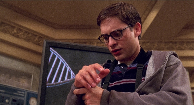

Visual profile of Spider-Man
This visual profile is calculated from 604 frames available in the WatchTheFrame collection.
Color palette of Spider-Man
Lighting and tonal range
Brightness: higher than 87% of films in the collection
DarkBright
Contrast: higher than 76% of films in the collection
LowHigh
- The analysed frames are brighter than most films in the WatchTheFrame collection.
- Saturated colors appear frequently in these frames.
- These frames contain a relatively high share of high-contrast images.
Composition and shot characteristics
Explore the visual relationships
Man on the Moon (1999)
92% color similarity
Rocketman (2019)
92% color similarity
The New Guy (2002)
92% color similarity
Strictly Ballroom (1992)
92% color similarity
The Fighter (2010)
92% color similarity
Dream Scenario (2023)
91% color similarity
Passion Fish (1992)
91% color similarity
Dodgeball: A True Underdog Story (2004)
90% color similarity
Coming to America (1988)
90% color similarity
Practical Magic (1998)
90% color similarity
Female Trouble (1974)
89% color similarity
Menace II Society (1993)
89% color similarity
Cool Runnings (1993)
89% color similarity
Todo sobre mi madre (1999)
88% color similarity
21 Jump Street (2012)
86% color similarity
Visual palette across 2 films directed by Sam Raimi
Visual tags in Spider-Man
Films with a similar visual profile
The Fighter (2010)
95% match · 196 frames
The New Guy (2002)
95% match · 461 frames
Dodgeball: A True Underdog Story (2004)
93% match · 640 frames
Rocketman (2019)
93% match · 560 frames
Female Trouble (1974)
93% match · 309 frames
Todo sobre mi madre (1999)
93% match · 284 frames
Man on the Moon (1999)
93% match · 547 frames
Dream Scenario (2023)
92% match · 400 frames
Coming to America (1988)
92% match · 541 frames
Passion Fish (1992)
92% match · 411 frames
Practical Magic (1998)
92% match · 688 frames
Strictly Ballroom (1992)
91% match · 489 frames
About this collection
Metrics on this page are calculated from 604 frames available for Spider-Man in the WatchTheFrame collection. They describe the analysed frames, not the film as a whole.